Refresh Soap Package
2017
Client : Korea Amorepacific,Inc.
Refresh is a soap packaging that I designed. The original intention of the design is to hope that customers will be impressed when they see the amazing outer packaging. The design of the logo uses the meaning of "regenerating once again". The logo is like a circular hour hand. The black letter 'RE' turns into a golden 'RE' after rotation, symbolizing that consumers can regain energy after using soap. Leaves skin glowing.In order to make consumers have an extraordinary consumption experience, I specially used a kind of soft rice paper in the packaging materials. This kind of paper can keep bright colors and provide a comfortable touch when printing.
Refresh香皂包装设计
2017
客户 : 韩国爱茉莉株式会社
Refresh是我设计的一款香皂包装,设计的初衷是希望当顾客在看到惊艳的外包装时会留下深刻的印象。标志的含义是'再一次焕发生机',logo像一个循环的时针,黑色的字母RE在旋转后变成金色的RE,象征消费者在使用香皂后能够再次精力充沛,让皮肤焕发光彩。为了使消费者拥有非凡的消费体验,我在包装的选材上特别使用了一种柔软的宣纸,这种材质的纸张在印刷时可以保留住鲜艳色彩,并提供舒适的触摸感受。


Lotte Energy Drink Package Develop
2017
Client : Korea LOTTE,Inc.
The development vision of the Lotte Group's sports drink project is to attract a large number of young consumers who are following the trend, so I developed two sports drinks for Lotte. I used the popular fault art technique to design the sci-fi visual shape for the packaging. This makes the sports drinks on the shelves look retro and avant-garde. The professional sports-oriented packaging is deeply loved by Korean young people.
乐天运动饮料开发项目
2017
客户 : 韩国乐天集团
乐天集团运动饮料项目的开发愿景是吸引大量追逐潮流的年轻消费群体,于是我为乐天开发了两款运动饮料。我用当下流行的故障艺术手法为包装设计了科幻的视觉造型,这让摆在货架上的运动饮料看起来复古而又前卫,专业运动感的包装深受韩国年轻人的喜爱。


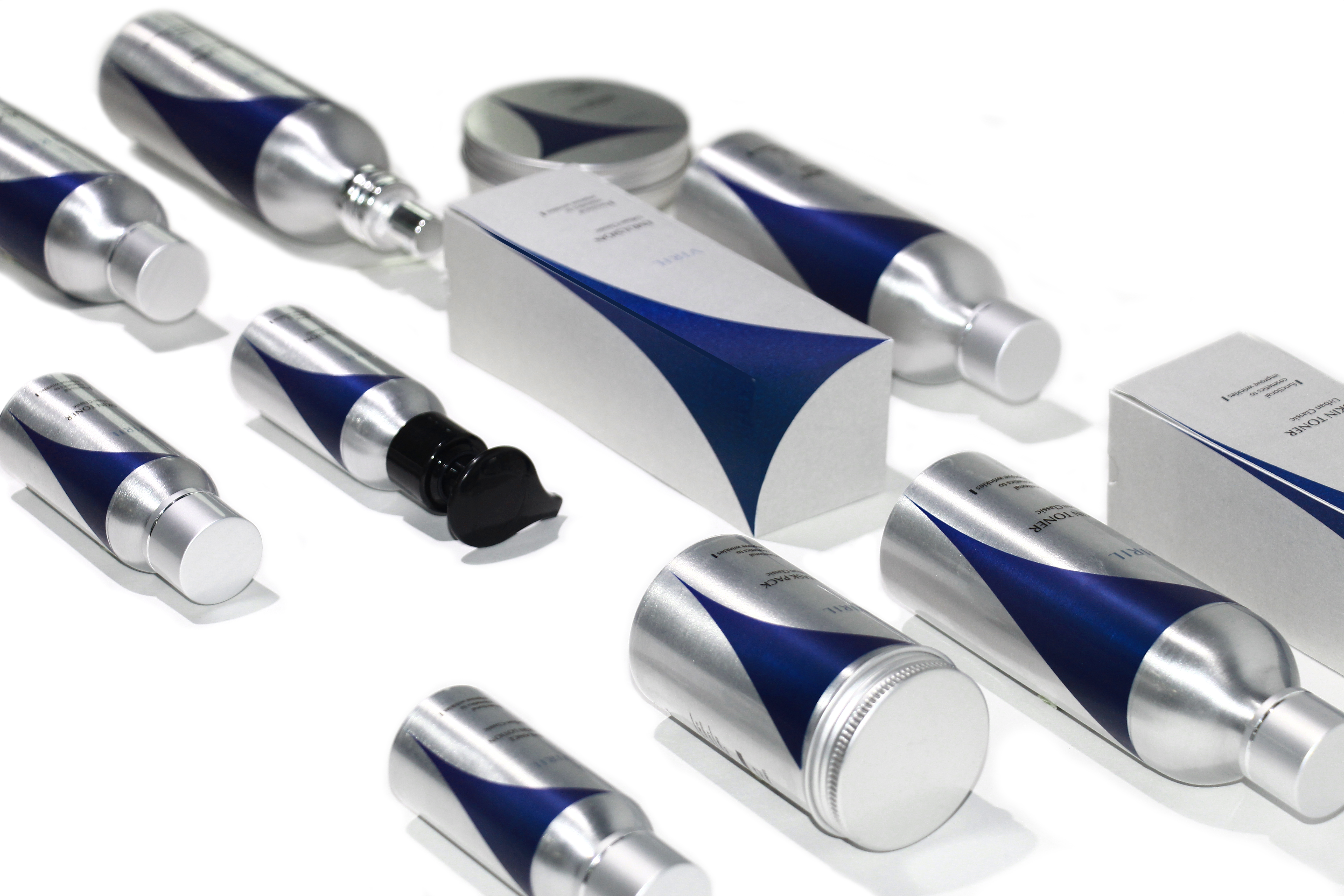
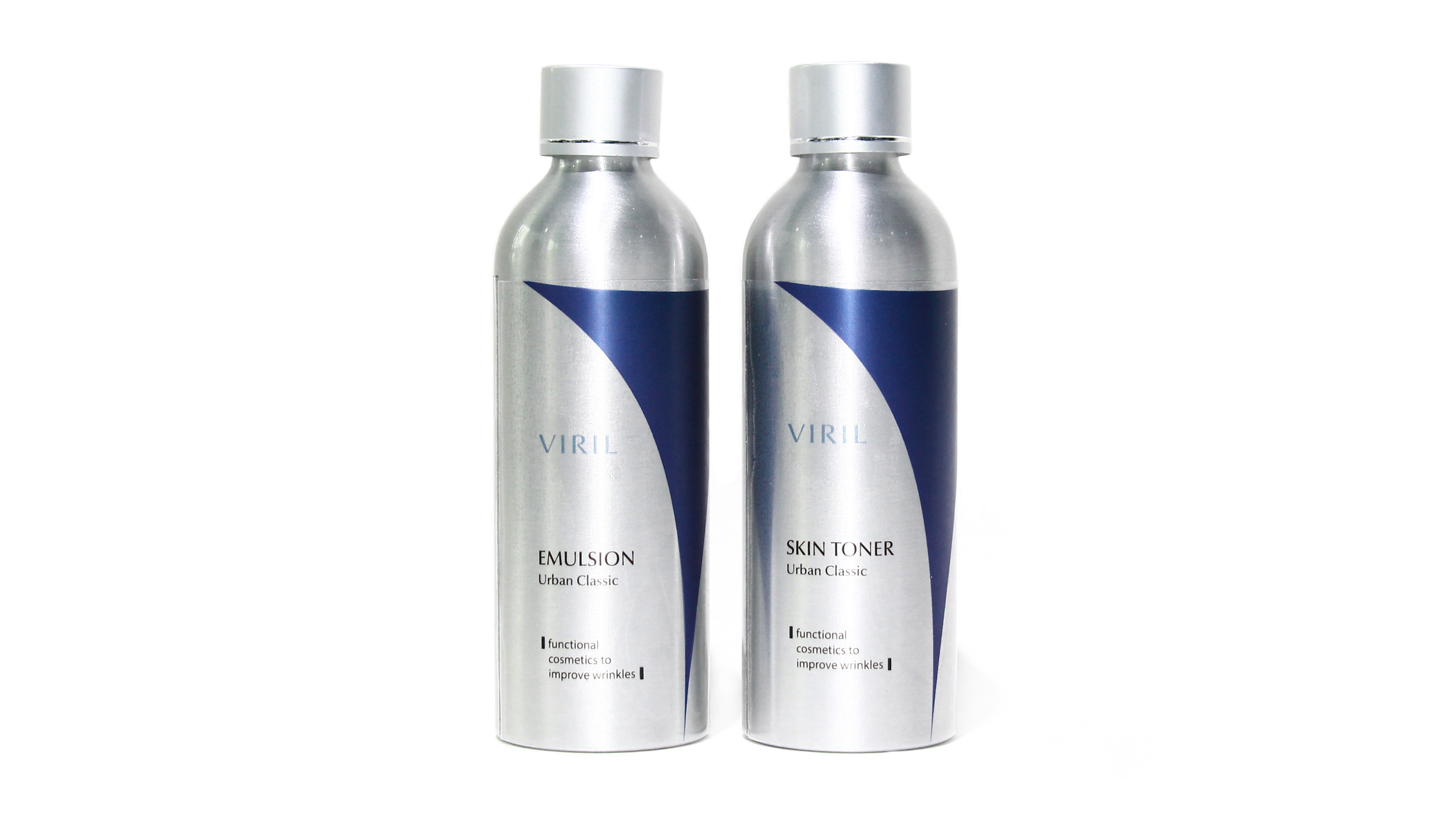
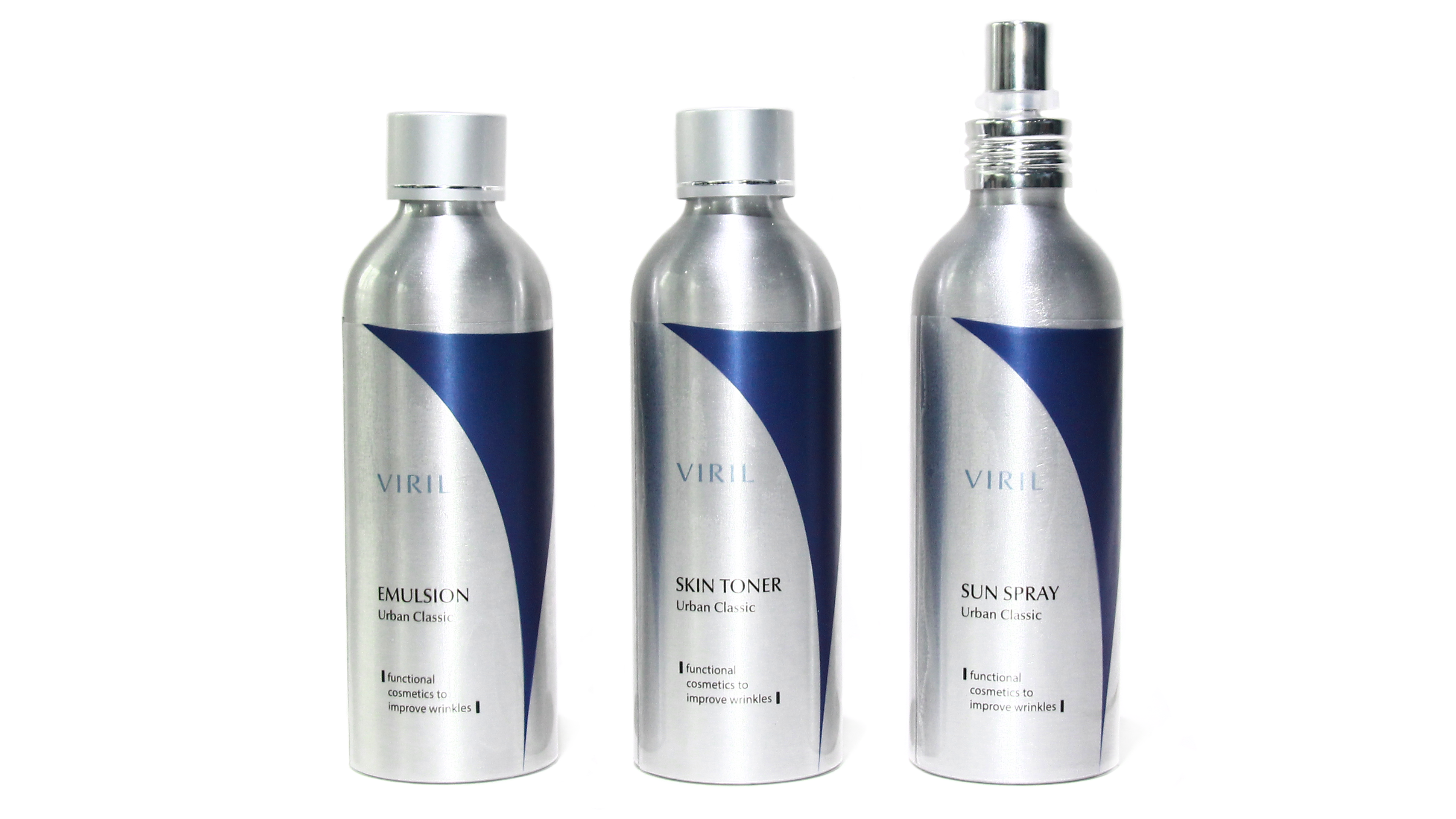
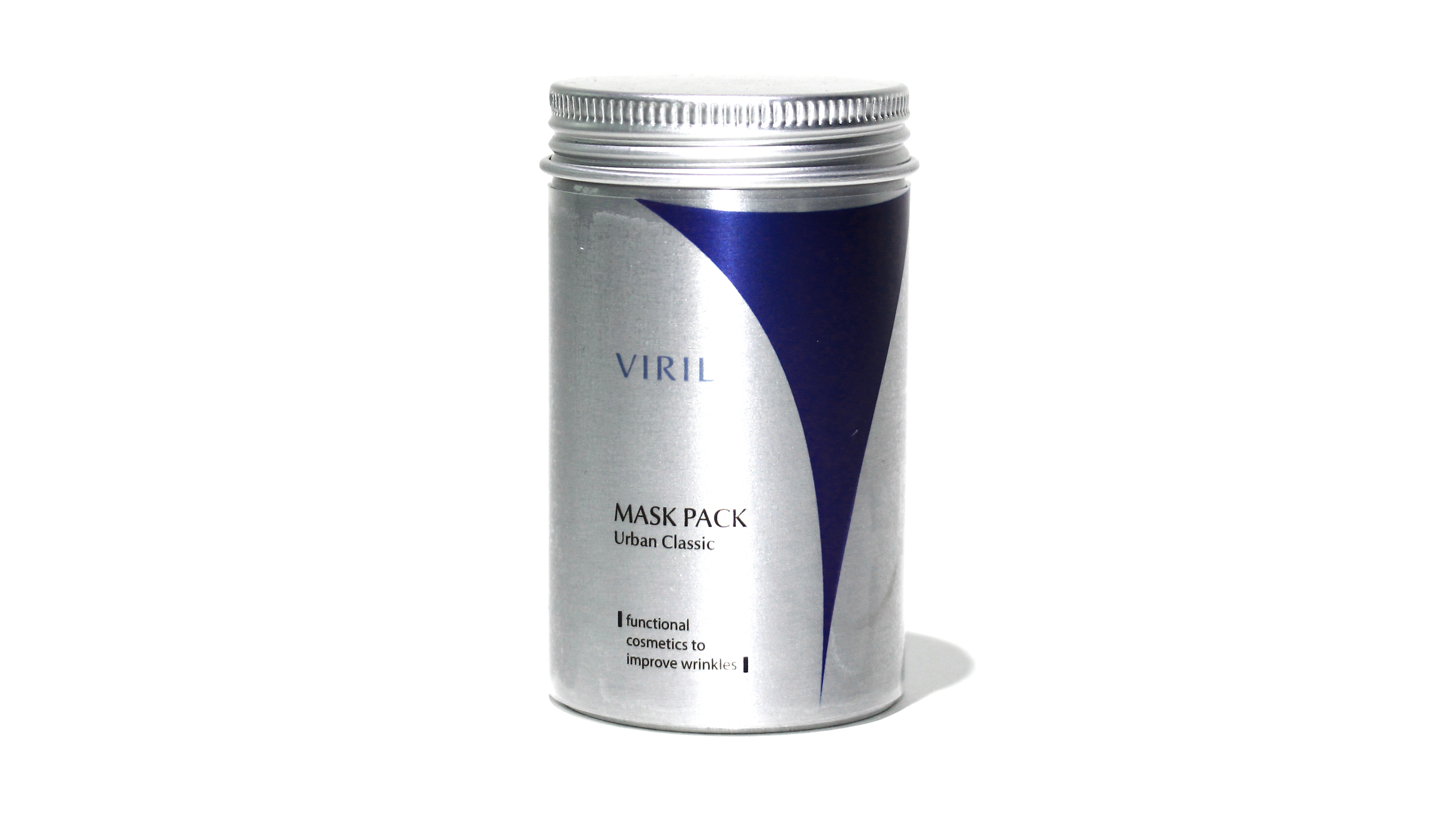
Viril Cosmetics Package
2017
Client : Korea Amorepacific,Inc.
This is my brand identity and a set of product packaging for the Viril men's cosmetics series.Viril means 'man's breath' in French, and the tension V-shaped symbol is like the charm of male blooming. The packaging emphasizes a capable yet sensual design language to highlight the sexy side of men.
VIRIL男士化妆品包装设计
2017
客户 : 韩国爱茉莉株式会社
这是我为VIRIL男士化妆品系列设计的品牌身份识别及一套产品包装。viril在法语中是'男人的气'的意思,富有张力的v字形符号像男性绽放的魅力。包装强调干练而又感性的设计语言,以彰显男士性感的一面。